I tried cropping it, and sent her the image. This morning in reply to her email I wrote more.
 This is published with Silvina's permission. The problem remains, if you don't like the squat shape of the cropped version, how do you deal with the composition? I wonder if full figure might have been better, but I didn't see the model. I had said that I thought she had a "mix" in the work, and following this is my later explanation.
For all my comments, imagine that I have said “I think that…” or “In my opinion….” Mix: you have a mix of useful and distracting information in the painting, and of finished and unfinished painting.
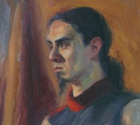
Reducing the space above his head gives him more strength, he is controlling the whole space with his energy. It makes him more powerful.
Giving just a glimpse of his shoulders is enough. It gives a “raw” feeling without the distraction of looking at his muscles and torso. Unless you are telling his story, feeding the viewer information, then it is better to let the viewer have more space to imagine. I think his story is in his face, not his body. I would either have focused on his torso or cropped heavily.
You have painted his face so beautifully! I wish I had painted it! The colours, the moulding of the features,. Just perfect! In the cropped version, background and features come together with both painterly brush marks and colour. In the un-cropped version the strength of the face and shoulders is bled out, diluted, by the unfinished or more loosely impressionist section. He looks a little hunted, anxious, even slightly vulnerable, arm ready to defend. If this is what you wanted, then more should be made of his arms. He is a watcher, but in the cropped version he is also a thinker.
The unfinished torso distracts (I am aware of the painting in life classes or with model and time constraints) because it is unnecessary, too much or not enough information, and weakens the work. It gives the impression that “Today I have this size canvas, I might as well fill it” or “Drat, not enough time, never mind, I’ll just get the basics down” – in that situation I would probably mark out on the canvas where I wanted to paint to, then paint a little further so that I could crop if necessary.
If his torso is important then it needs to be developed to the extent his face is developed, but in that case you could have two focal points, broken by the grey and red clothing. For this to work well (difficult, I think) then the drape would possibly provide a link, and would need to be worked more in form and colour (leaning more towards chiaroscuro painting) to link the whole painting.
When cropping I always look at the bit about to be cut off (family photos etc, I crop them a lot) by covering the rest, and asking myself “am I about to lose any information that adds to this memory”. If the answer is “No” then almost invariably I end up with a better image. The left edge I cropped a little because your lighter, brighter colour mid-way down the canvas suggests a slightly different light source than is on his face.
Having decided to crop your image I did it intuitively. Later I asked why I had chosen those edges. The interesting lower edge on his clothing gives information that confuses or intrigues, but I think it distracts too much from the wonderful treatment of his face.
Friday morning: I wondered why I chose to put this portrait on my blog. I think it is because Silvana paints in a manner that has always eluded me. I have been criticised, however kindly, for not having a distinctive style. I disagree. I think that no matter what medium I am using, apart from the Cassino series based on photographic images, my "stamp" is very firmly on my work. I can look at another's work and say "I wish I could do that", knowing that something in me makes my work my own, despite my intention to emulate another. When I do "do that", in another style, I don't feel that the work is mine. And if it lacks that integrity, I am not happy with it.
I have on my computer a collection of portraits by other artists painted in that lovely, painterly manner with rich colour and strong brushstrokes. But when I paint, even when they start out like that, I have to smooth, to tidy, to blend, and my portraits end up looking as though ... yes, as though *I* have painted them. Funny that!
OK, rant over. Back to pushing colour around...

No comments:
Post a Comment